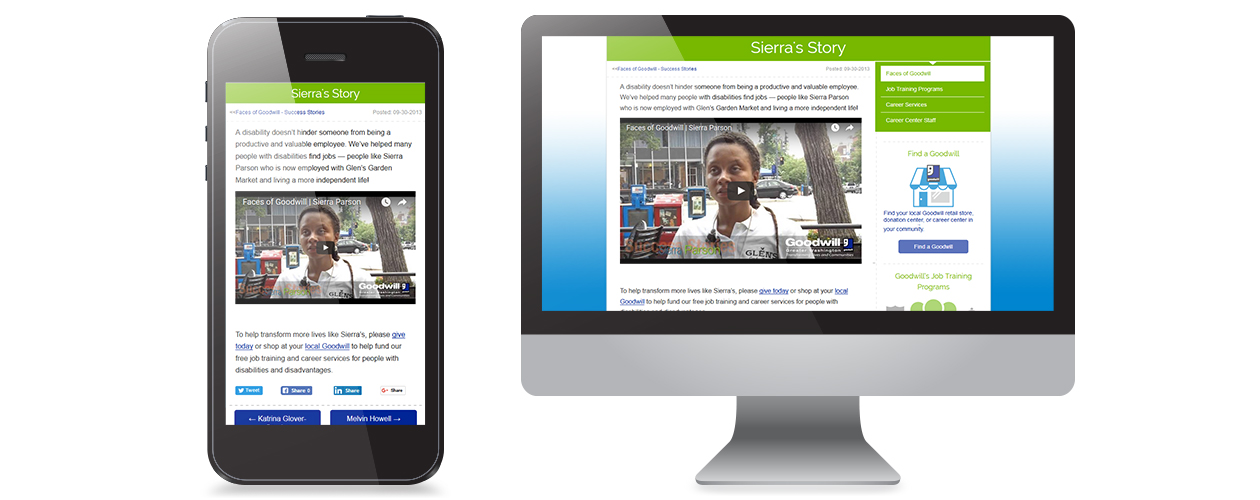
My Role Data Driven With A User FocusIn 2014, I led the redesign for Goodwill of Greater Washington’s mobile website experience. I oversaw and executed all phases of the redesign process including user research, design, prototyping, user testing and development.
Data Driven
My mobile strategy and design decisions were supported by user data and market research. This helped me communicate and validate my approach to gain executive buy-in throughout the course of the project.
User Insights & Discovery
I analyzed the existing user data to understand the users’ motivations and behavioral patterns. This helped me identify user pain points, specifically for mobile users.
Experience Strategy
I met with department executives to compare the organization’s goals with the previous user behaviors. From this, I was able to plan an experience strategy to balance both organizational and user expectations.
Prioritizing Content
I worked with the web content team to restructure the website’s content. This created a content hierarchy and was heavily aligned with user preferences.
Vision & Experience
I took a mobile-first approach when designing the website’s wireframes and prototypes. This filtered and prioritized important content for mobile devices.
Design & Development
I designed multi-device wireframes and prototypes for a simplified interface that suited the website’s content. I also served as the project’s web developer. My diverse set of skills allowed me to create functional wireframes, which helped accelerate the development timeline.
Testing & Evaluation
I arranged moderated remote usability tests to evaluate user behavior toward the new content structure and mobile interface. The data collected from these tests gave me a deeper understanding into user motivations.
Setup & Launch
My duties also included replacing the old website with the new website. This involved processes to avoid user confusion or drop in search engine rankings.
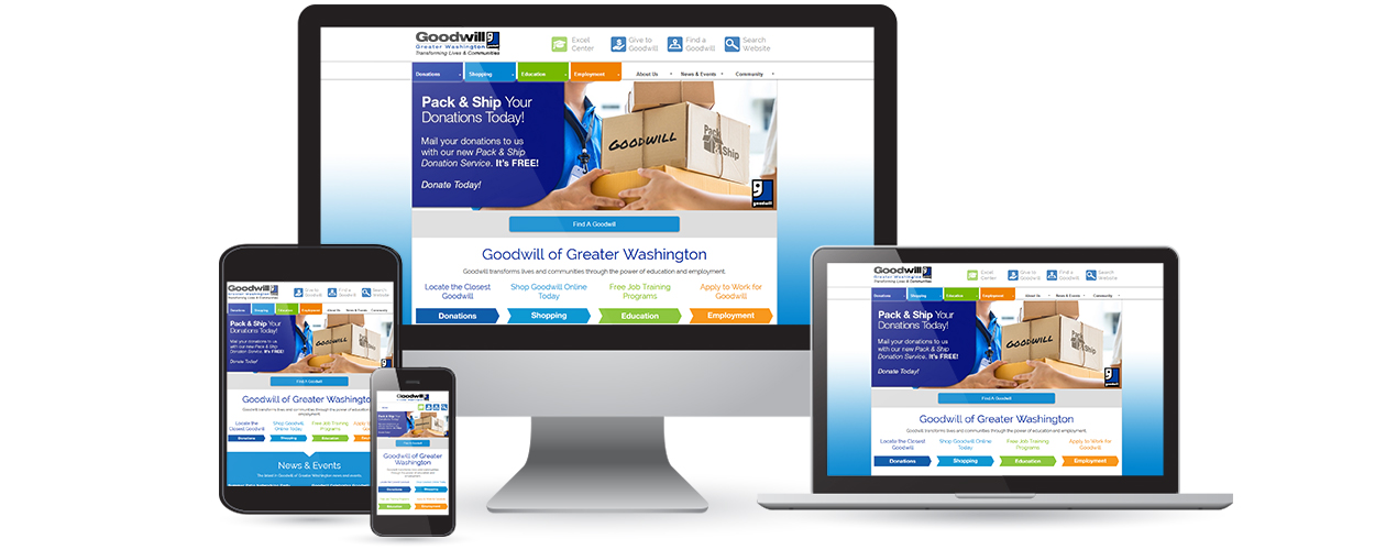
The Challenge Create A Consistent Mobile ExperienceBy 2014, mobile web standards had grown to the point where users expected both mobile and desktop experiences to be the same. At the time there were a few solutions to meet these new mobile standards. I chose to redesign the website’s mobile experience with a mobile-first and responsive strategy to meet the expectations of the growing mobile user population.
My goal was to deliver a seamless mobile experience to allowed users to access the same information as the website. This approach would allow for a consistent and enhanced mobile experience.
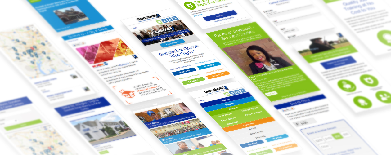
Vision & Experience User Friendly & DependableMy vision for the mobile website was to deliver full-scale content to the user through an intuitive interface. I wanted to serve the best mobile experience without sacrificing content experienced on the desktop website. I started by prioritizing content so users could find information they actually wanted.
Goodwill’s mobile users expected us to understand their desires and fundamental need for information. I wanted the users to appreciate speed and easy access to information on the new mobile website. My understanding and implementation of mobile accessibility, mobile-first design and responsive framework gave Goodwill’s users the best mobile experience.
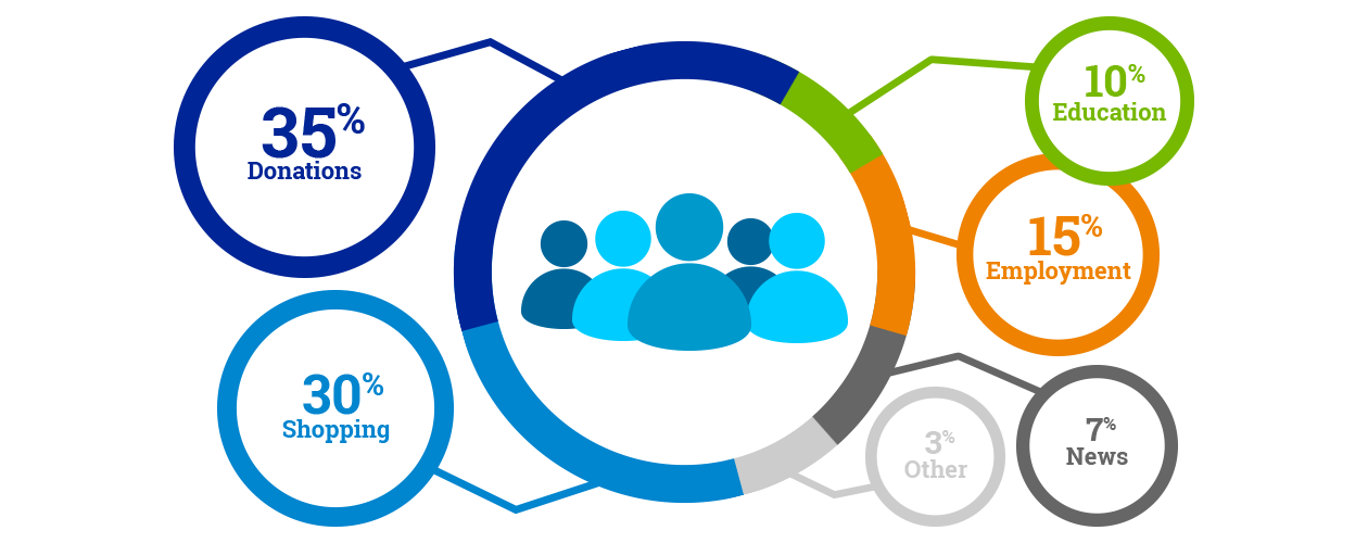
Discovery Phase: User Content Preferences
User Insights & Discovery Content And Accessibility Are KeyThe combination of my market research and user data analysis drove the planning phase by identifying user issues. Here are some key discoveries that I addressed.
![]()
Mobile Growth
Between 2013 and 2014, Goodwill’s mobile traffic increased by 50%, making these users a primary customer segment of online traffic.
![]()
URL Chaos
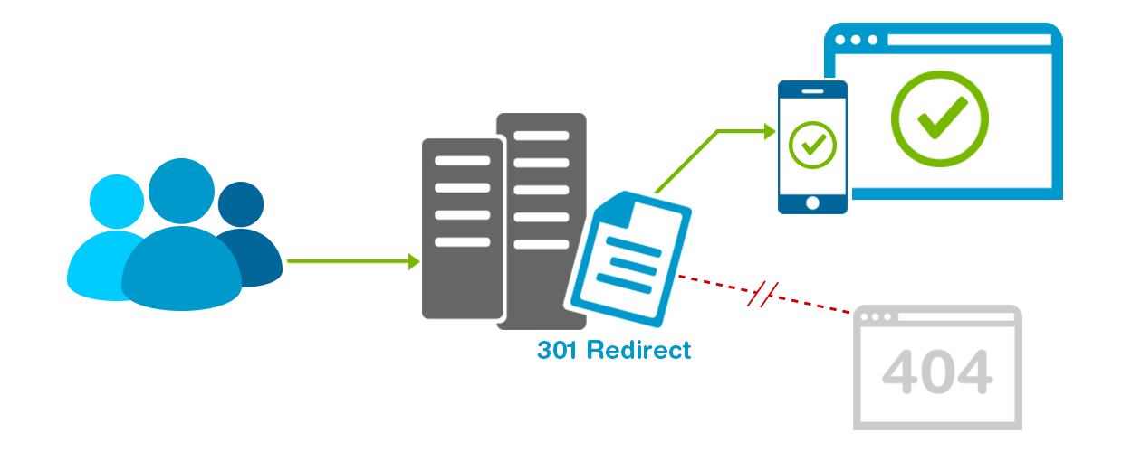
I identified several challenges with the old mobile URLs. Any direct linking to internal pages needed a URL suffix to bypass a mobile redirect. The URLs were not optimized for search engines, and caused issues for visiting mobile users from third party sources like social media and emails.
![]()
Terminal Terminology
The previous website was inundated with internal language that was foreign to the target audiences. This complicated user efforts to locate content and limited search engine optimization.
![]()
Overlooked Content
Important sections of the website were hidden and unsearchable because of the previous website’s content was organized into a physical representation of Goodwill’s different department offices. This content structure was developed to please internal division heads and not structured for customers and clients.
![]()
Content Management Pains
The previous scaled-down mobile website was independent from the main website. This made it difficult and time consuming to manage and update mobile content.
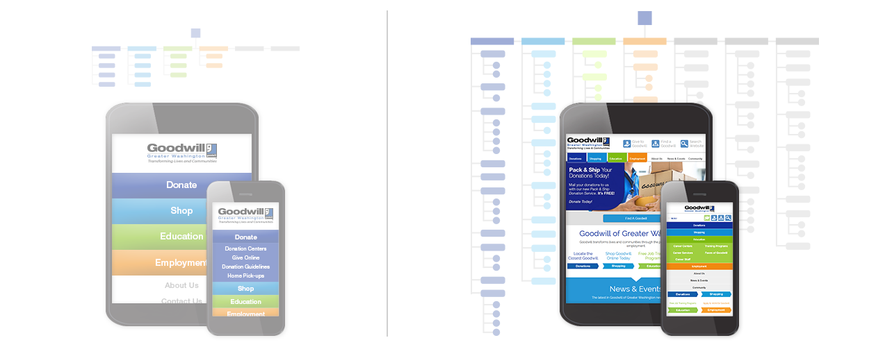
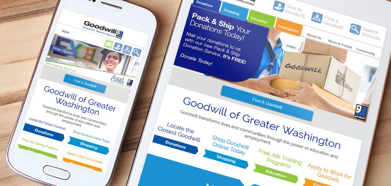
I created a plan to remove the scaled down mobile website and take a mobile-first approach to redesign the mobile experience. This would allow all content to be accessed from any device. (Old Mobile Experience (left) and New Responsive Experience (right) Mobile Sitemaps, Homepage, Navigation Renderings.)
The Approach Mobile-first & User-centeredTo keep time and resources to a minimum, I kept the primary design elements of the existing website and applied a mobile-first approach to prioritize content and features. My strategy reduced the change impact for current users and reduced content clutter to put a focus on user-desired information.
My concept was simple – use a mobile device’s screen real estate to filter and prioritize content while leveraging a responsive framework to deliver a consistent mobile experience.
This content-focused approach made the redesign process more efficient, and made for a user-friendly final product.
Design & Development From Diagrams to PrototypesMy previous experience as a web developer, allowed me to combine design and development processes. I was able to develop partially coded and functional wireframes, which reduced time spent in the development phase.
Content First
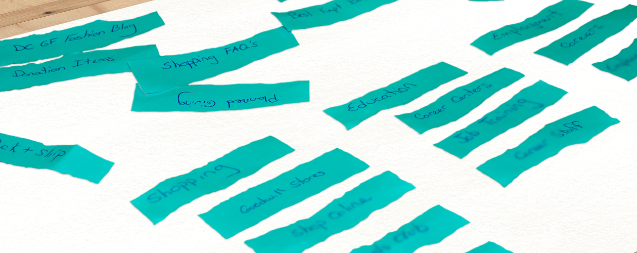
The insights I gained from the discovery phase revealed the sections of the website that needed to be prioritized. This new information helped me organize the website’s content into logical sections based on user preferences.Content: I worked with the content team to rearrange the website’s content into meaningful sections by using the old school, but still effective, paper label method.
Site Map
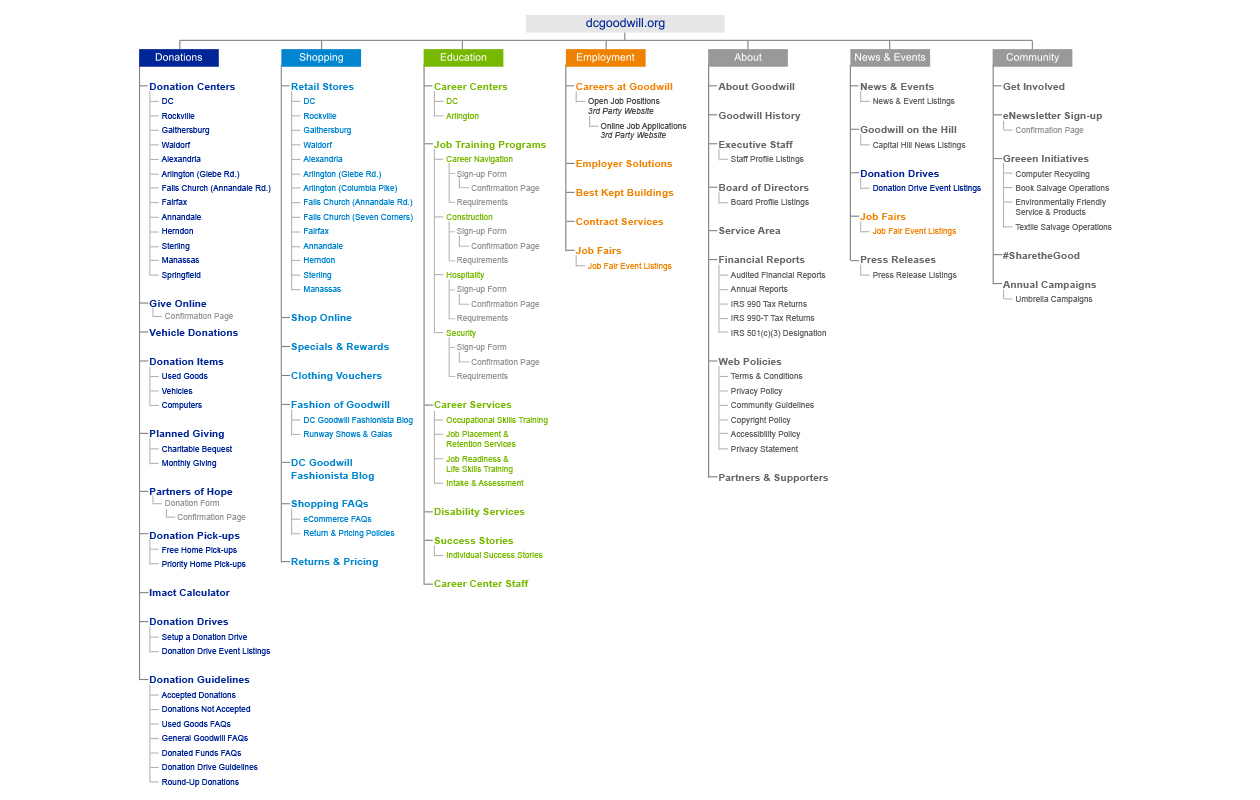
I created the site map as a visual road map for the content, and I developed it based on user demand and user intuition. The site map also helped me brief and justify the new content structure to stakeholders.Site Map: I structured the content into categories so users could easily find the information they were looking for.
Wireframing
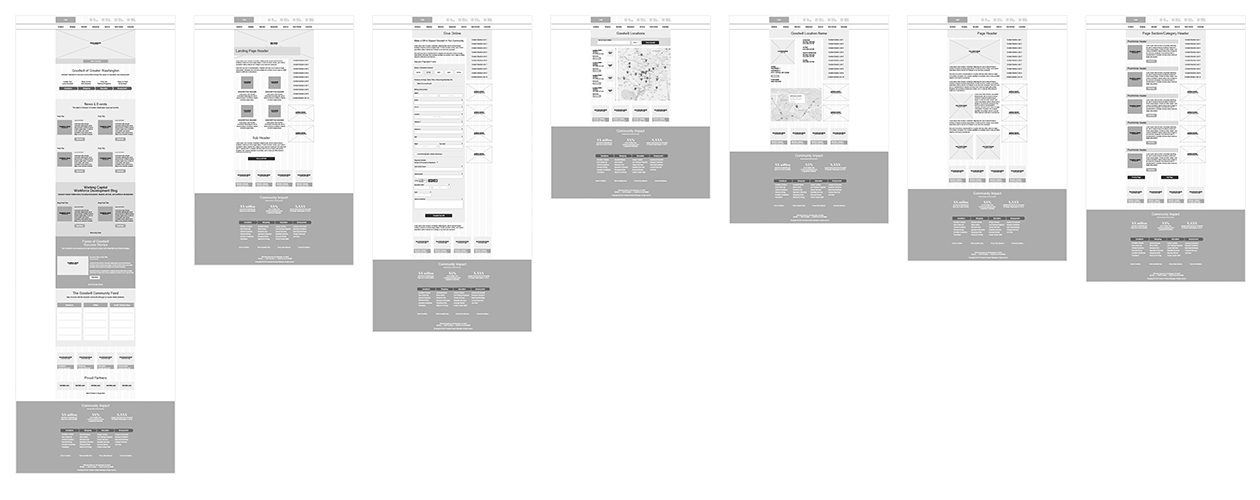
I used the wireframes to identify content breakpoints, which I were determined by the website’s content. These breakpoints allowed me to maximize the screen real estate on different devices.I coded some interface elements in the wireframes, like menus and buttons. This helped me to identify appropriate interactions and gestures, as well as to save time during the development phase.
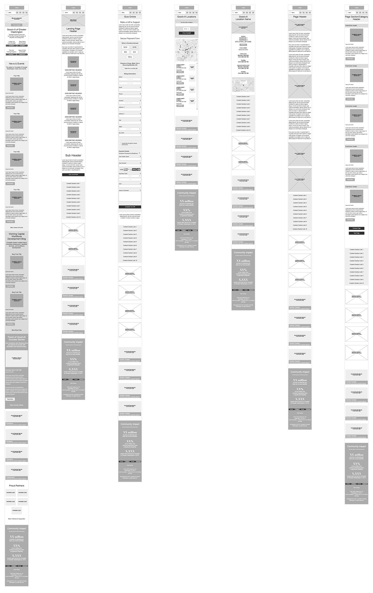
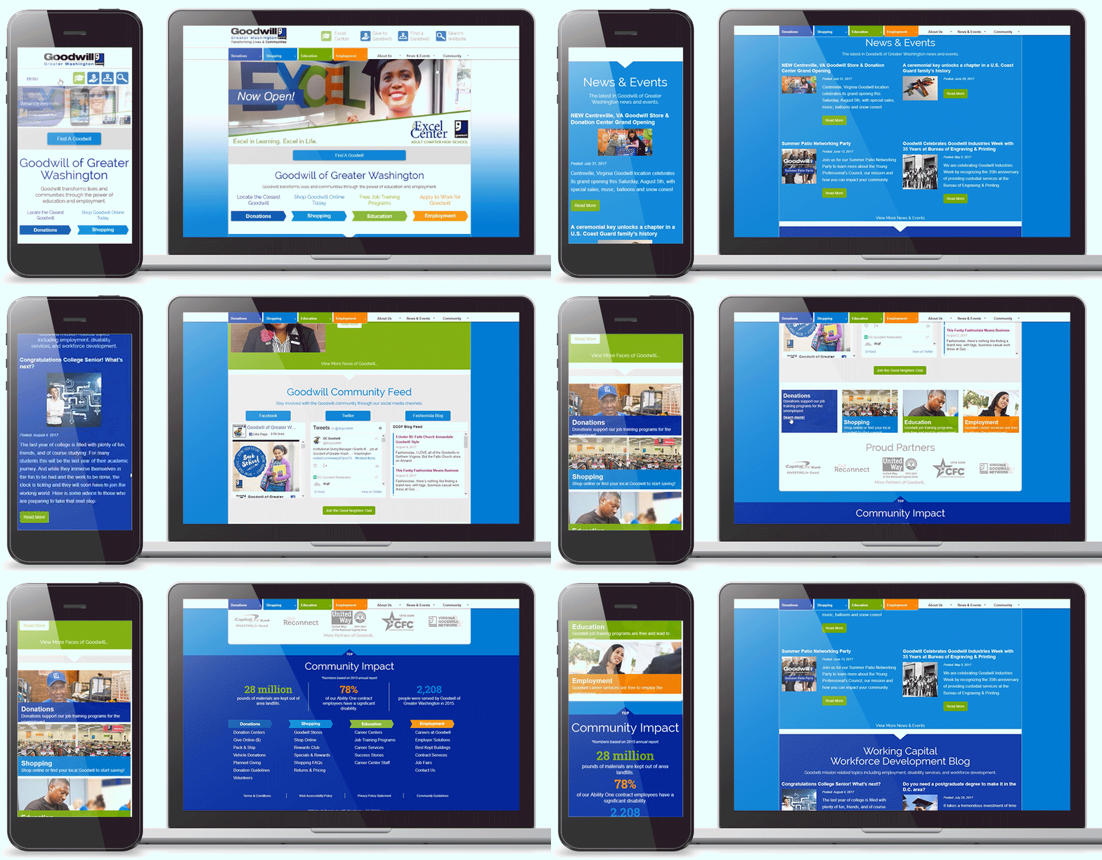
Primary responsive page templates designed for the website’s content.
Responsive mobile page templates designed to restructure page content to the device’s screen width.
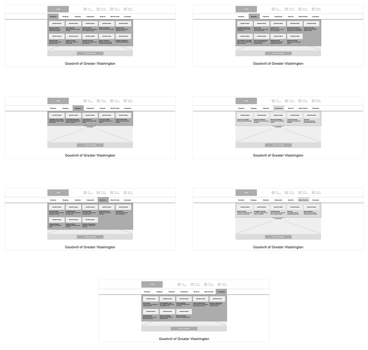
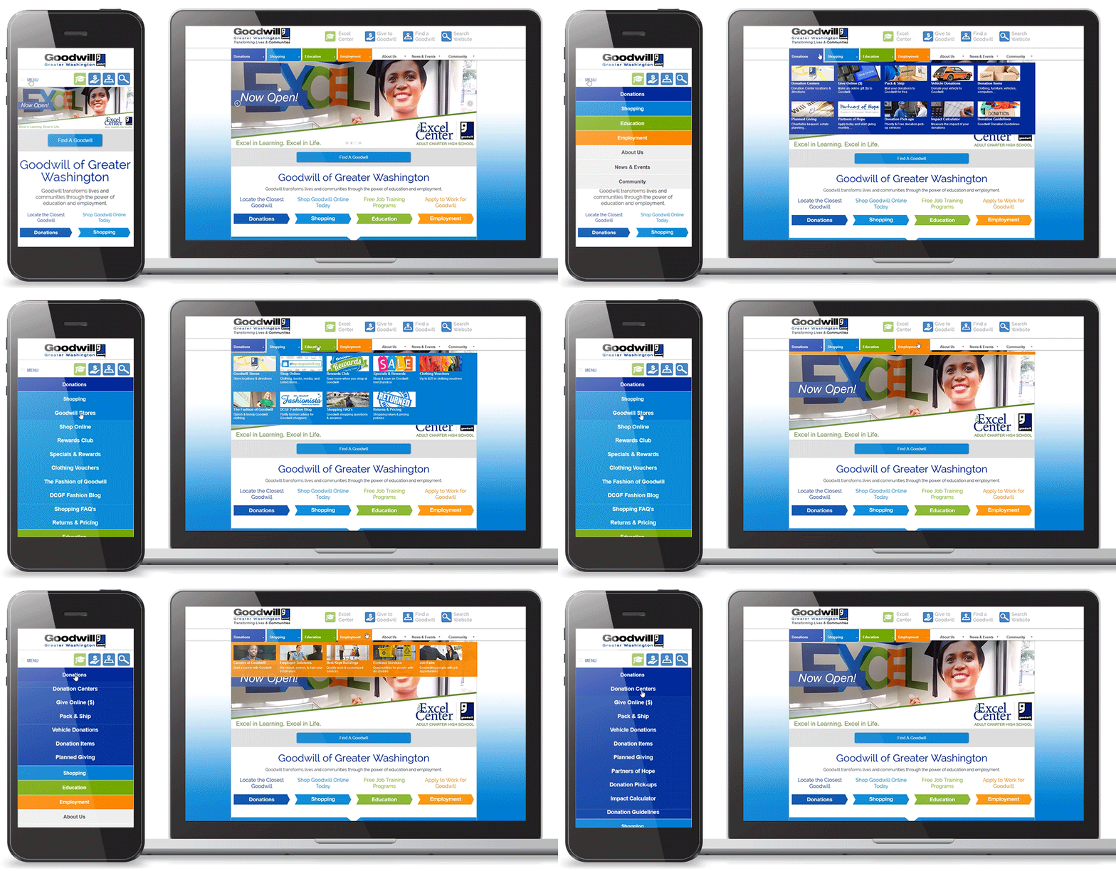
Responsive desktop menu that gives the user a clear understanding of each button’s destination with help from a link description and descriptive thumbnail.
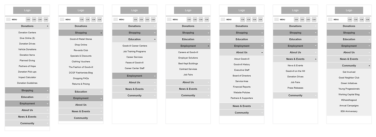
Responsive mobile menu that simplified from the larger desktop menu.
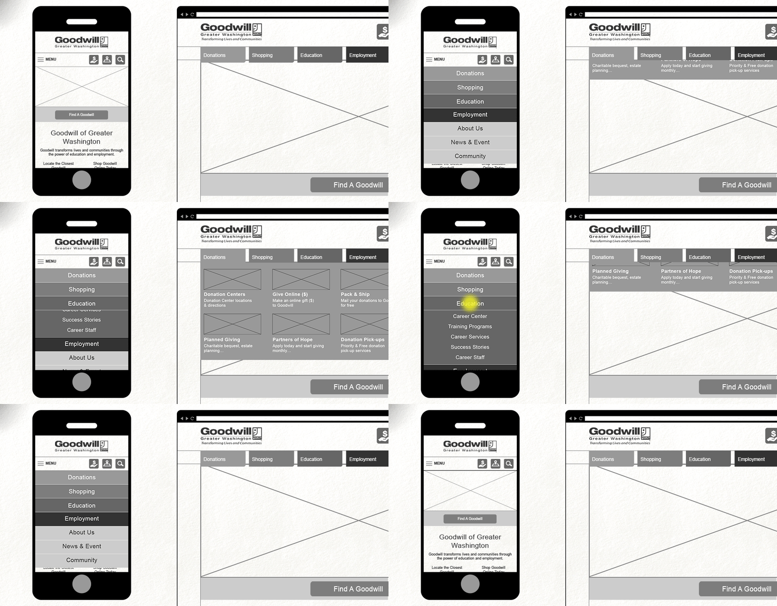
Wireframing: Side-by-side mobile and desktop comparison of the main navigation.
Prototyping
I designed the prototypes in detail to test the interactive functions, content and features on multiple devices. The level of detail I included allowed me to fine-tune each interaction and feature before going into the testing and evaluation phase.Prototype: Home Page
I knew it was important for the mobile homepage to load quickly and give the user the same content and experience as the desktop website. I removed load bearing sections, such as the social media steam, from the mobile homepage due to their negative effects on speed.
Prototype: Main Menu
The previous mobile website’s main navigation was easy to access, but was stripped down and did not provide the user with direction to all parts of the website. My solution was to leverage a two-tiered accordion menu so users could see all of the menu options.
The desktop’s main navigation used buttons consisting of a title, description and a thumbnail. These elements gave context to the button, and gave the user some foresight to where that button led. Along with these elements, the larger button areas helped with accessibility for Goodwill’s audiences with disabilities.
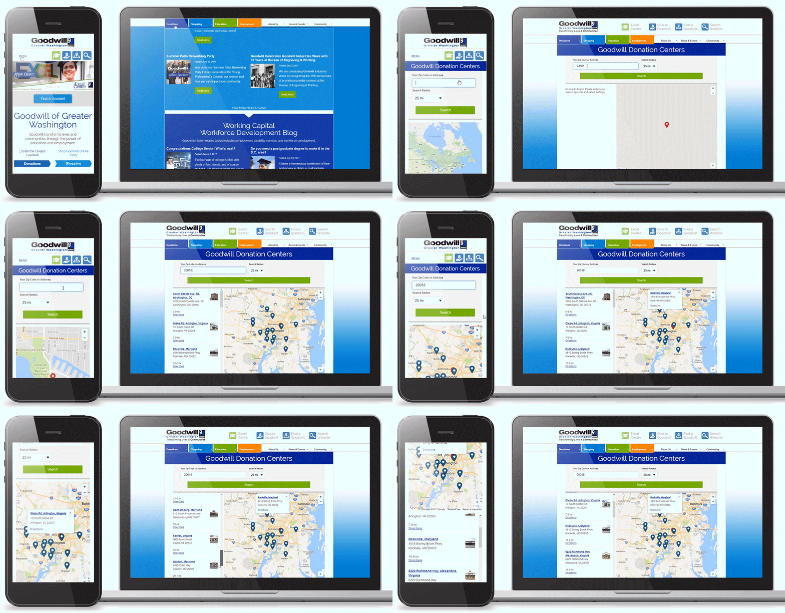
Prototype: Goodwill Locator
Previously, the location finder only consisted of a list of Goodwill locations that were provided in no particular order. To make this user friendly, I replaced this list with an interactive map that automatically lists the locations closest to the user by IP or GPS location. This change was the result of user feedback from the testing and evaluation phase.
Note: For the example animation above, I manually chose a zip code my location, due to my physical location when creating the example.
Testing & Evaluation Validation of AssumptionsOnce we had a finely-tuned prototype, I knew the best way to test the new mobile interface and content structure was to let our audience take it for a spin. I opted to hold moderated remote usability tests, due to resource availability, to evaluate our mobile design and content organization solutions.
The user insight I gathered during these tests both validated solutions and pointed out a few potential risks:
- Performance
- Location Wayfinding
- Responsive Media
Fortunately, the solutions to these issues were relatively simple.
Performance
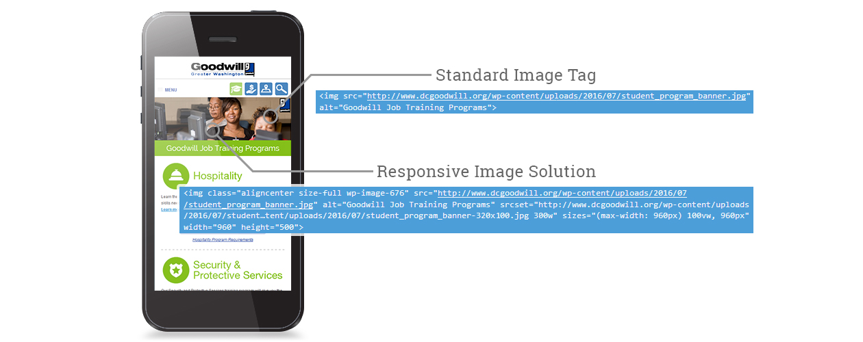
During the user testing, I tracked page loading times for both data and WiFi networks. This was particularly important because of the direct impact performance has on the user experience. The average page loading times tested, higher than I was comfortable with, especially for the data connections.Responsive Images: At the time, this method of handling responsive images fit Goodwill’s needs. After the release of WordPress v4.4 I leveraged it’s built-in responsive image function.
The impact images were having on the page load times immediately stood out to me. I reevaluated the previous mobile image solution and updated it to leveraged image “srcset” and “size” attributes (new technology at the time). I also combined individual interface graphics into image sprites to help reduce repetitive server requests.
After making these updates, I significantly decreased the page load times.
Note: Development took place prior to WordPress v4.4, before WordPress had built-in responsive image support.
Location Wayfinding
From previous user insights, I knew that most people wanted to see the closest location first. The previous locations page was a static page that simply listed each location in no particular order. This was obviously built under the assumption that people already knew which Goodwill was the closest to them. The static page was interfering with the user’s experience and relied on the assumed user’s knowledge of Goodwill addresses.“I have to scroll through all of the locations and find their addresses before I know which Goodwill is the closest to me.”
~Anonymous Beta TesterTo increase efficiency, I added standard location functionality and filtering to the page (locations prototype above). The user’s location was automatically identified or could be manually entered by zip code. This filtered and organized the locations by distance, and was accompanied by an interactive map that included directions.
By leveraging location technology, I improved the user experience, and lead to a higher conversion rate for users searching for a Goodwill location.
Responsive Video
The majority of Goodwill’s video content was hosted by their YouTube channel. I copied the video content over to the new responsive framework under the assumption that YouTube’s embed code would flex with the responsive framework.Responsive Media: Leveraging YouTube allowed me to take advantage of their captioning feature and embedded video framework.
I faced some initial challenges when the videos did not properly stretch with the website’s framework. Fortunately, I was able to solve this problem by dynamically wrapping YouTube’s video framework when a video is embedded.
The Launch 3… 2… 1… Let’s Go!I wish there was a big green button that simply replaced the old with the new, but there isn’t.
Once I resolved the issues from the usability tests, I focused on migrating the old content to the new website. Before touching the directories and databases, I made sure to document the URLs that would need a redirect when the new website went live.
404 Errors: The new website had an improved URL structure compared to the old website’s unfriendly URLs. By redirecting old URLs I prevented a drop in search engine rankings.
The new website migration went smoothly and the redesigned website was a success.
The Impact Positive NumbersAfter the launch, I observed a performance increase in the following areas:
- Increase in overall traffic
- Increase in mobile users
- Increase in mobile users time on website
- Increase in traffic to the education and careers sections of the website
- Reduced page load times
- Reduced bounce rate
- Simplified user paths
- Increase in search rankings
- Streamlined content management
Reflection My TakeawaysEvery project brings its challenges and every challenge is an opportunity to grow. Here are a few things that will stay with me for future projects:
Internal Struggles
During the planning phase, some department executives had their own opinions and goals for the redesign. From my perspective, this lead to a jumble of personal goals overpowering the primary user needs.I took a proactive, strategic approach by limiting executive reviews during the redesign process. I backed up my decisions with user data, which helped mitigate assumptions based on personal preference.
This ultimately created more data-driven decision-making on areas that would lead to an improved user experience.
It’s Not Always About The User
When I analyzed the website’s analytics, it was clear the previous website was not meeting the organization’s expectations. For example, there were important sections of the website that were seeing minimal traffic. The analytics suggested the audience was simply not interested in these sections.However, from Goodwill’s perspective, these sections were important to the mission and the community services they offered. For the new website, I developed the content strategy to generate more traffic to the under-performing, but strategically-important sections instead of focusing on what the user data suggested.
After the new website launched, these sections saw a significant increase in traffic.
Data Doesn’t Appear Out of Thin Air
In order to collect and analyze data, you need to first implement the appropriate methods and tools to capture the data. The previous website did not have the appropriate tools to capture user interaction and event data. This made it difficult for me to develop solutions for troubled areas within the website.For the usability tests, I made sure to include event-tracking to analyze events, interactions and user paths. This led to a more in-depth understanding of user behavior when performing specific tasks.
Recognition Recognition for Non-profit WebsitesDuring my time as the Director of Creative Services and Web Development at Goodwill of Greater Washington I won the following awards for dcgoodwill.org:
- 2015 Web Publishing – Redesign Gold
Association Media & Publishing EXCEL Awards- 2015 Web Publishing – Design Excellence Gold
Association Media & Publishing EXCEL Awards- 2014 Non-profit Website Silver
W3 Awards- 2012 Non-profit Website Award of Distinction
Communicator Awards
