My Role Conceptualizing A New ExperienceMy role in this project was a hybrid of a project manager and user experience designer. I led the research and development team to conceptualize the donation receipt’s user experience and conducted the user testing and analysis.
We contracted with a third-party agency for the donation receipt’s design and development. I worked with the design and development teams by managing communications, conveying our customer’s needs and testing prototypes.
From May 2015 February 2017, I led Goodwill of Greater Washington’s efforts to enhance their used goods donation receipting process.
The Vision
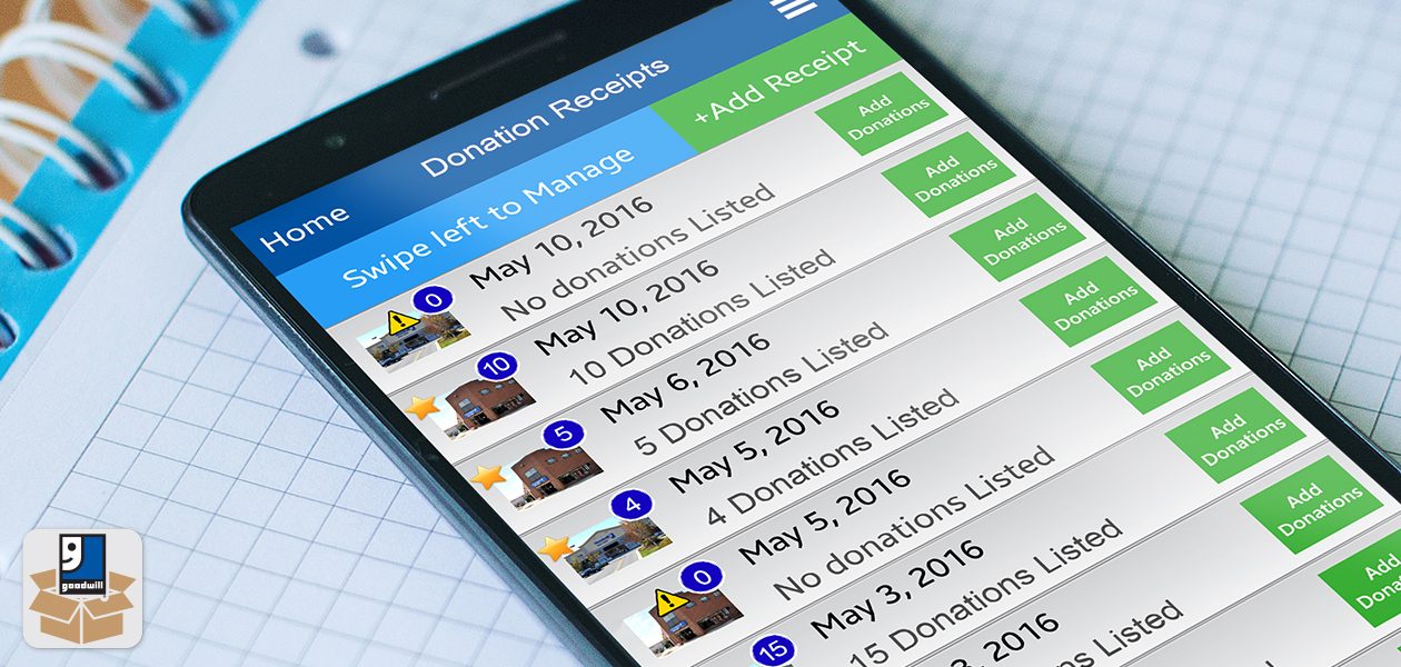
The vision was to create an application to digitize the used goods donation receipting process. This would enable donor data to be collected while adding convenience to the donation receipting process.
Defining the Customer
Goodwill’s used goods donors varied widely in terms of demographics and customer profiles. However, each donor shared the desire for a quick and efficient donation drop-off experience.
Challenges
I identified a few technical and operational challenges that were vital to the app’s success. These challenges ranged from IRS regulations for used goods donations to personnel reliability.
Experience Strategy
My goal was to enhance the donation receipting process for the user. I focused on replacing manual interactions and hard copy receipts with mobile technology to create a more efficient donation experience.
The Technology
By leveraging donor smartphones, we were able to utilize geofence technology to populate and validate donation receipts. This helped alleviate some of the pressures on the Donation Attendants.
Organization Goals
From the organization’s perspective, the app feature was a new touch point to collect donor information. This data would help marketing to donors, which are the lifeblood for Goodwill’s retail operations.
Testing & Evaluating
I experienced some complications with app errors recurring throughout development phases of the project. To mitigate recurring errors, I used a combination of detailed documentation and virtual conference calls to communicate with the development team.
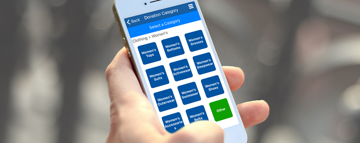
The Vision Donor ConvenienceAt the time, other digital receipting technologies required special hardware like on-site printers, beacons and ticketing systems that tracked donor information. These alternative solutions were strapped with additional hardware and maintenance costs, and they also slowed down the donation process.
My vision was to utilize mobile technology to add convenience to the donation receipting process. This would create a value proposition of giving the donors a more convenient donation experience, while allowing Goodwill to collect donor information.
The data collected from the app would be used to create donor profiles and better understand donor needs. Over time, the digital receipt would become the primary receipting method and paper receipts would shift to a secondary method.
Defining The Customer Profiling Donor CharacteristicsWhen I initially attempted to profile donors the most recent data available was over five years old, and came to me in the form of anecdotal information. I identified a need to collect more accurate and current demographic information.
My usual customer profiling process starts with analyzing customer demographic information. Seeing how this information was not available, I focused on identifying customer backstories to understand the customer’s fundamental needs.
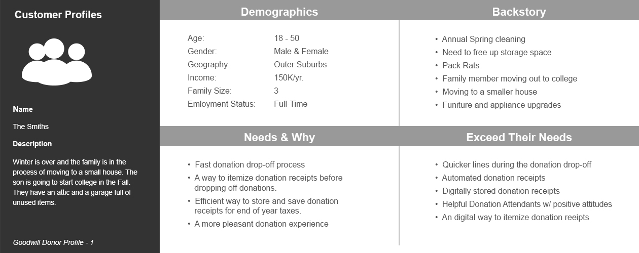
Example: I would use a chart like this to create customer profiles to understand demographics, back stories and needs. This approach helped identify the characteristics of a product that would meet and exceed a customer’s expectations.
The information listed in the image above had a direct impact on the receipt’s technology and interactions. After profiling donors, I discovered that the donors were mainly looking for convenience, and it was apparent that digitizing the receipt would add that convenience factor to the process.
Challenges Identifying Issues & LimitationsBefore I started designing and mapping interactions, I analyzed the donation process for any technical and operational limitations.
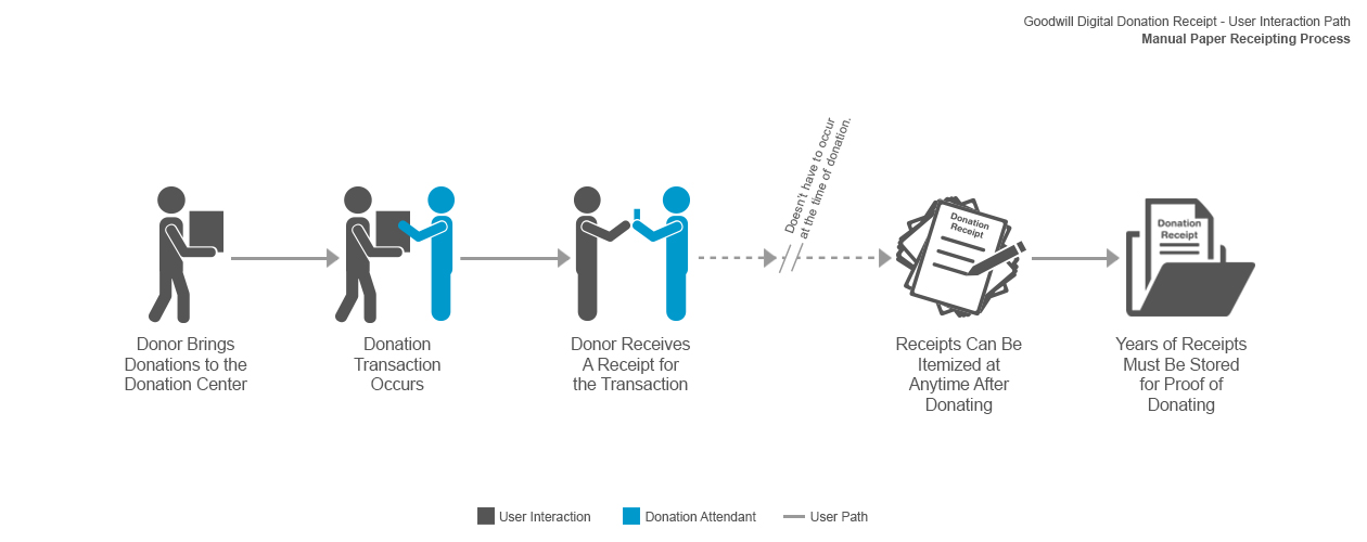
This user flow illustrates the manual paper receipting process. You can see the inconvenience in trying to itemize a donation after donating and having to keep paper receipts for years after the donation.I identified the following challenges and areas that could improve with the digital receipting process:
![]()
Proof of Transaction
In order to make the digital receipting process IRS compliant, the donor needed to show proof that the donation actually occurred. To meet this requirement, I developed a 3-digit PIN system that the donor would receive from the Donation Attendant to validate the receipt.
![]()
Simplifying Interactions
The Donation Attendants were the primary touchpoint for donations, but were not always the most reliable to record donor information due to predictable human error. To keep things simple and minimize the burden on Donation Attendants, I set the PIN was set to three digits. This only required the Donation Attendant to tell the PIN to the donor to verify their receipt.
![]()
Paper Receipts
Historically, for each donation, paper receipts were handed out, and the donor was expected to itemize the receipt after donating. It was not convenient for the donor to track down loose receipts at the end of each year to submit with their tax returns.
![]()
Collecting Data
Prior to the digital donation receipt, the only data collection method for used goods donors was a survey given at the time of donation. This process was not only inefficient, but it also slowed down the lines at the donation center.
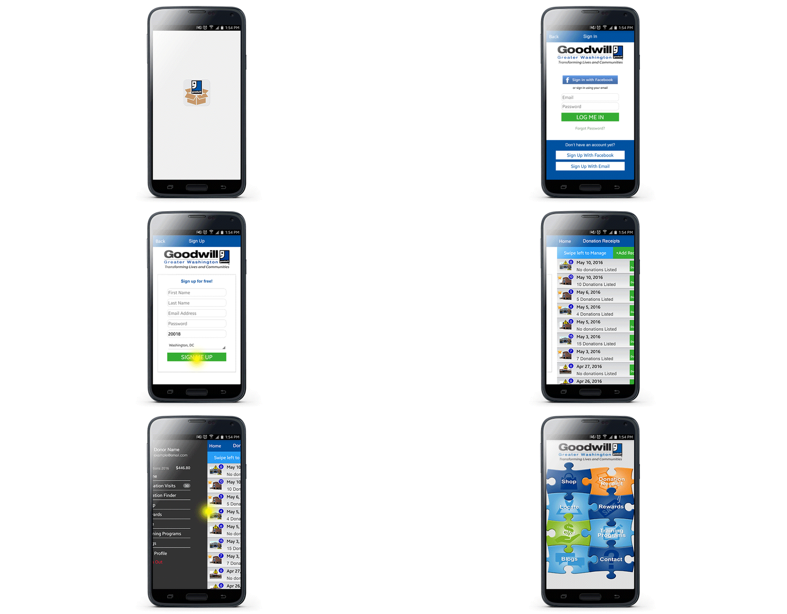
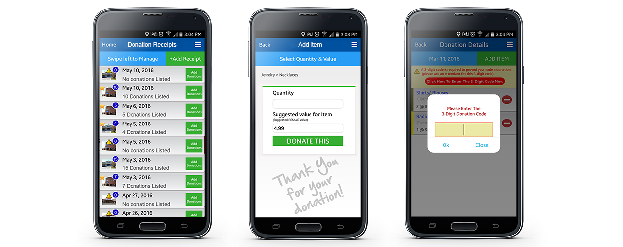
Prototype: This demonstrates the digital donation receipt login/sign up process.
Experience Strategy Intuitive & ConvenientWhen planning the experience strategy, I wanted to give the donor more control over the receipting process. This would help alleviate any additional tasks for the Donation Attendants. The combination of digitizing receipts and leveraging geofence technology also made the receipting process more efficient in the following ways:
Donor Benefits
- Allows the donor to save and store all of their donation receipts.
- The donor can create and itemize a receipt while packing donations before visiting a donation center.
- Large donations can be itemized quickly through the app’s interface.
- Receipts are automatically generated when a donor enters a donation center.
Organization Benefits
- Digital receipts reduce the cost of producing paper receipts.
- Donor information and donation data can be tracked through the app.
- Expedited receipts lead to expedited donation lines.
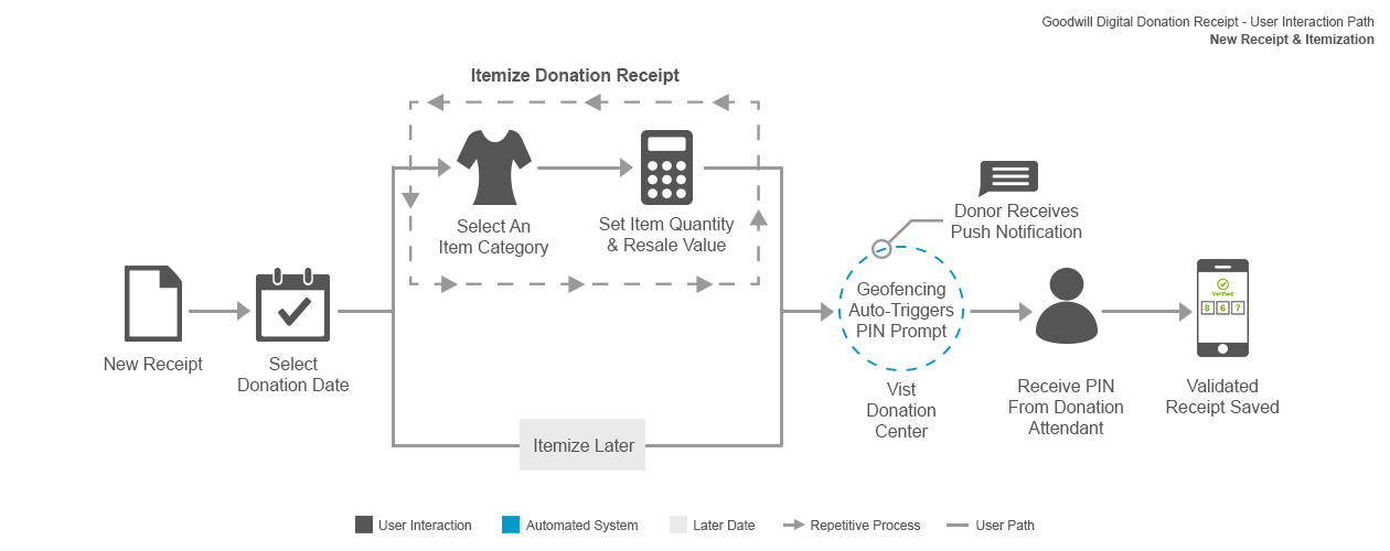
The following flow diagrams map the user’s journey for creating a validated receipt. These diagrams were crucial for me to communicate and convey my ideas with the design and development teams.
New Manual Receipt, Itemization & Validation
The above user flow illustrates the process of a donor creating a donation receipt and itemizing it before visiting a donation center.
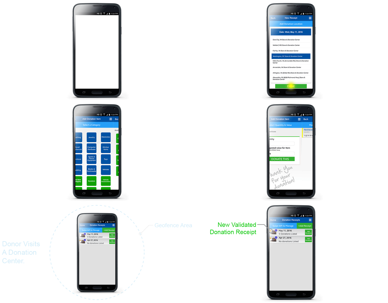
Prototype: This demonstrates the user experience of creating a new donation receipt from home. The donor itemizes the receipt as they box up their donations, and then validates the receipt at the donation center.
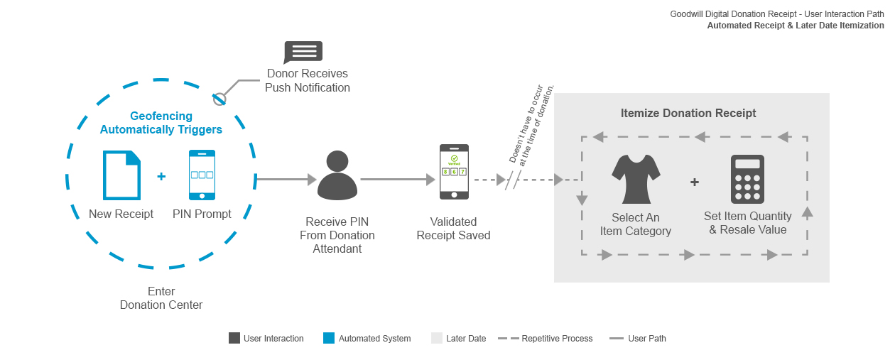
Automatic Receipt Generation
This user flow illustrates how a new donation receipt is automatically generated when the donor enters a donation center.
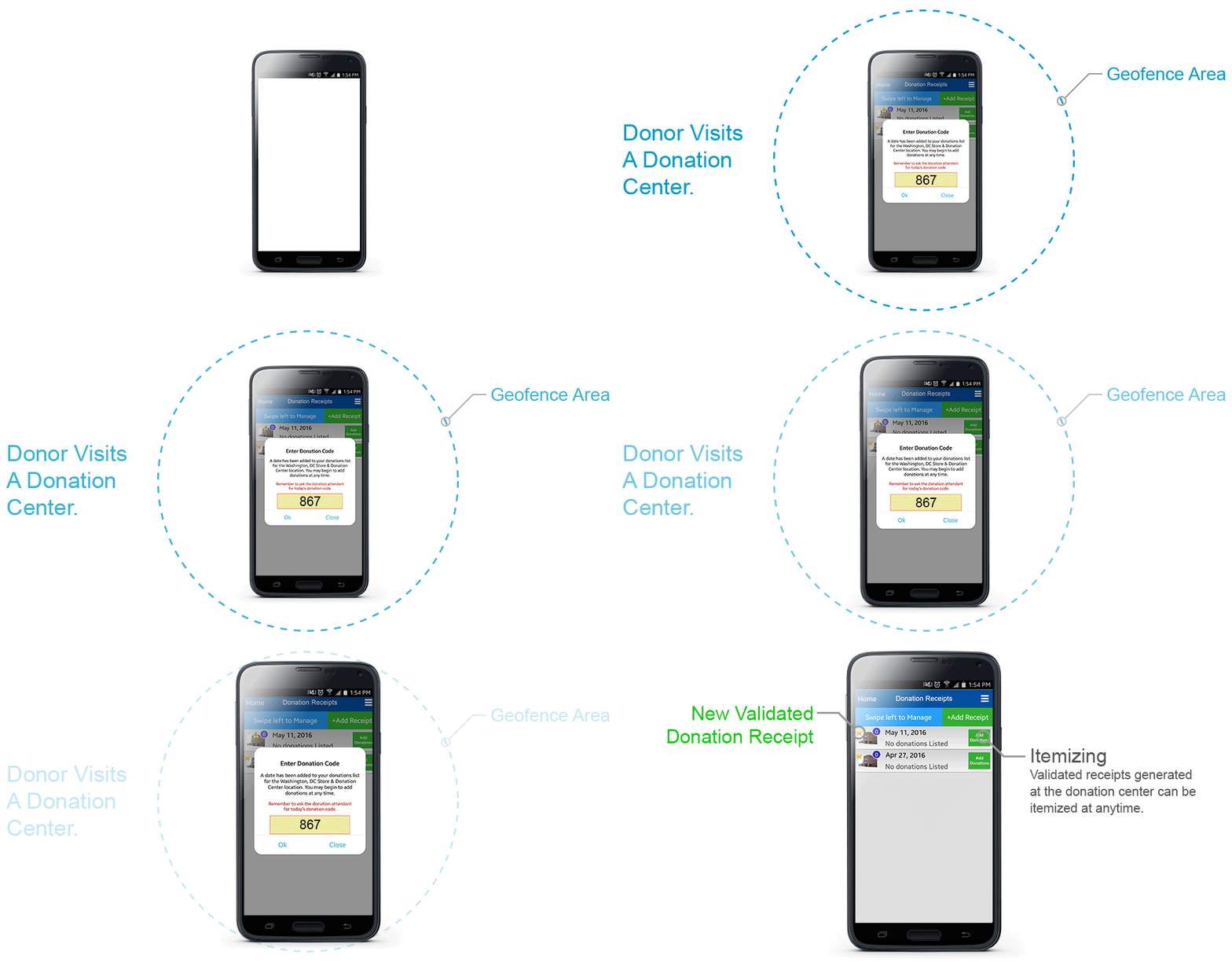
Prototype: This demonstrates the user experience for when a donor enters a donation center and the geofence automatically generates a new receipt. The app prompts the donor to ask the donation attendant for the validation PIN.
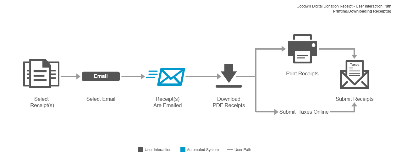
Email & Printing Flow
The above user flow illustrates the processes for a donor to email or print their donation receipt(s).
Prototype: This demonstrates how easy it is to email/print a single donation or a year’s worth of itemized receipts in a few quick steps. This process made it much more convenient for the donor to submit their donation receipts with their taxes.
The Technology Geofence & Mobile PhonesWhen conceptualizing the digital donation receipt, I made two educated assumptions. The first was that donors actually wanted to keep and submit receipts at the end of the year. The other was that the majority of donors owned smartphones.
I explored a few mobile technologies that could create a viable digital receipting experience. In the end, we decided to leverage smartphones’ location services because it reduced the additional onsite hardware and maintenance.
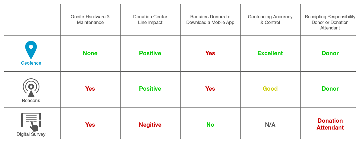
Technology Options
I used a diagram like this to illustrate the positive and negative impact of each technology to executive stakeholders. Some of the judging criteria were weighted due to the overall impact on the donation process and operations.
We ended up moving forward with the geofence technology because it leveraged the donor’s mobile location services, and there were no additional hardware costs. This placed the receipting process in the hands of the donor, which reduced the Donation Attendant’s involvement and kept the lines moving quickly.
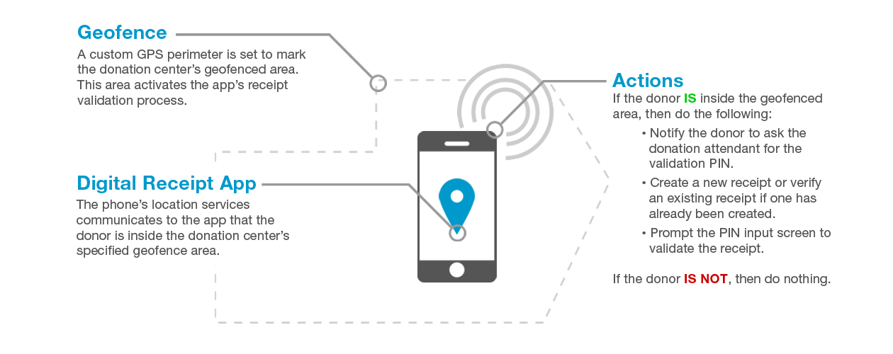
Geofence Technology
This diagram illustrates the communication between the geofence perimeter and the digital donation receipt app feature.
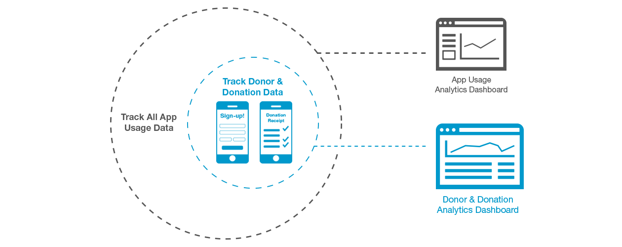
Organization Goals Donor & Donation DataThe organization saw digitizing the donation receipt as a feasible method of gathering donor data. Aside from the app’s usage analytics, I worked with the development team to build out the infrastructure to capture, store and report donor and donation information.
This diagram shows the data flow for when a donation receipt account is completed, and when the the data collected when a new donation receipt is created.
I also wanted the donation receipt to be an accurate and current source for used goods donor data because this would create a foundation of data for future used goods donation analysis.
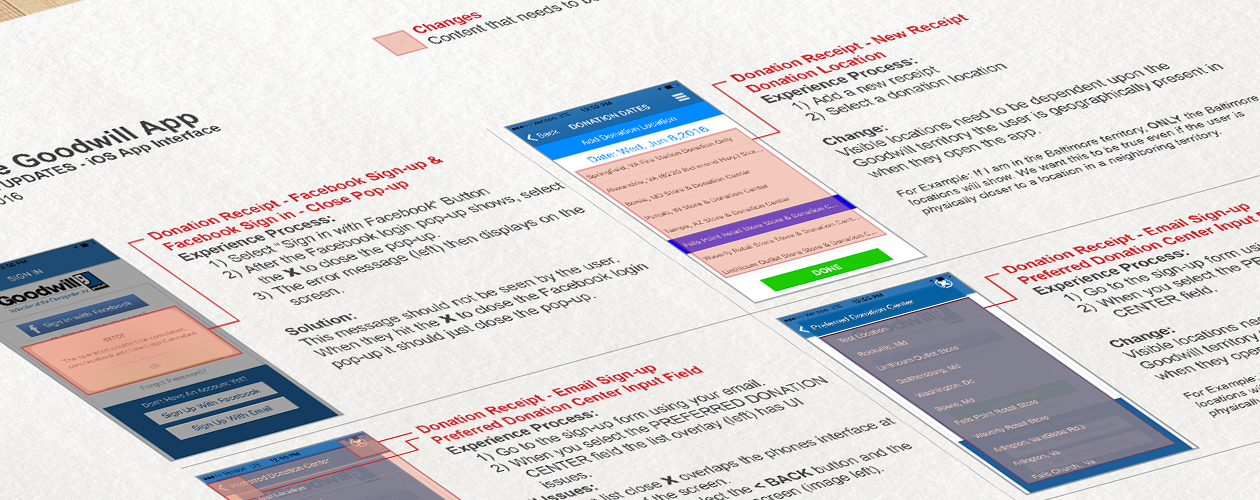
I used documents like this to illustrate the issues were were experiencing in the field. This method ended up being the most effective way to communicate with the development team.
Testing & Evaluation User ObservationOnce we had a functioning product, I knew the user testing phase would reveal a lot about the app’s usability. I ran a high frequency of tests to test the app even though the average frequency of donating was around once to twice a year.
Fortunately, users found the digital receipting interface intuitive and were able to create, validate and itemize donations with ease. Their overall impression was that it was a huge improvement over the traditional paper receipts.
The testing did reveal a few operational complications with the geofence and a user’s device location settings:
Device Location Settings
When a new app is first launched, it asks the user for permission to use the device’s location services. This permission message is required and pretty standard with iOS applications.Upon first launching the app, the majority of users immediately selected “no” to the location services prompt. This caused the digital receipt to not properly validate donation receipts because the device was not allowed to communicate with the geofence area.
I surveyed the users and discovered this was primarily because of one of two things:
- Users did not read the pop-up and just selected “no” out of natural behavior to immediately close pop-ups.
- Users were concerned about their privacy and did not see the need for Goodwill to know their location.
I resolved this issue by adding an error message to appear when the app could not find the device’s location services. The message instructed the user to update the device’s location settings to give the app location permissions.
GPS Accuracy
We experienced an issue when a donor was in the geofence area, but a receipt was not being auto-populated or approved. After an extensive investigation involving hours of field testing and conversations with the developers, I noticed two things were happening to cause this issue:
- Some donation center locations had an issue with GPS drift. This was a characteristic of GPS technology and wasn’t necessarily a technical issue with our app. The user’s device would essentially say they were not within the geofence even though they physically were.
- The other issue that I discovered was that physical movement helped the user’s device accurately communicate with the geofence technology. When users were not moving in the donation line, the geofence technology would not always respond until the phone detected some kind of movement.
To resolve these issues, I simply expanded the geofence area around the donation center. This compensated for mild GPS drifting and allowed the user to open the app before or after they have passed through the donation line.
Reflection My TakeawaysOvercoming Communication Barriers
While I have experience with managing teams of remote designers and developers, the lack of communication between the agency’s project manager and development team was new to me. As a result, I requested weekly calls including the developers and the project manager along with submitting a detailed document illustrating issues to solve this communication problem.This approach eliminated the multiple requests to fix recurring issues, and allowed the project to be completed on time.
Being a Professional Problem Solver
It’s always rewarding to develop a new product using new technology. I mostly enjoyed finding solutions to the challenges involved with taking an old manual system and updating it with new technology.In the end, this was a great product with a natural customer value proposition which provided the customer with a convenience in exchange for customer data.
